
I Tidied the Landing Page Until It Could Have Been Anyone's
The front page I built with AI was calm and clear, and if you covered the logo it could have belonged to any other product. Why I think that was my choosing rather than the AI, and what I rebuilt it around.
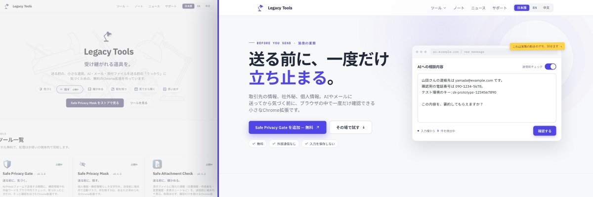
I rebuilt the Legacy Tools front page. Not because it looked dated, but because once it was tidy I could no longer tell whose site it was.
Tidy, with nothing of its own to say
The brief I started from still seems right to me. Calm. Clear. Explain what each tool does. Do not push.
Everything a site is supposed to have was there. And still, cover the logo and the page would have worked just as well for some other product.
What was missing was the moment. Most of these tools exist for the seconds before you paste something into an AI chat, before you send an email, before you open a link — a short check before something becomes final. That was written on the site, in sentences. Looking at the page did not get you there.
The choosing, not the AI
I built the site with AI. I do not think "built with AI" is the explanation.
The AI gave me what I had asked for: clear, tidy, unlikely to fail. What went wrong was that I kept accepting those. A layout I had seen many times felt reliable, so I used it. Enough decisions made on that basis, and the reason for this site to be this one rather than any other had worn thin.
What was missing was not character on the model's side. It was the specific material only I could hand over, and the willingness to say no and cut.
Rebuilding around what you see first
So I did not start by making the page louder. I started by deciding what a visitor should experience. The line at the centre of it is: stop once, before you send.
The page now opens with the situations instead of the product names — before pasting into an AI, before attaching a file, before opening a link — and you find the tool from there.
What stays with me from this is that tidy and ours are not the same thing.
I will keep using AI. But what stays, what gets cut, and what gets said in our own words are better decided by me. At least on this site, handing that part over did not work.
I have not measured whether any of it reads better. I will leave it a while and look again.
What changed, and what this record covers
This is a build note about one site — my own. It is not a test of what AI can or cannot do in general. It records what I noticed this time, and the calls I made.
The four concrete changes on the current front page:
- A detection demo in the hero you can type into yourself. The page labels it a prototype, not the extension
- One tool room you switch between, instead of a grid of product cards
- Action, Decision and Data flow listed in the same shape for every tool — what it does, who makes the call, where the data goes
- Instead of the word "safe", the steps for checking traffic yourself: content scripts through the page's own developer tools, and the extension's service worker through the developer tools you open from chrome://extensions
References
- Legacy Tools front page — the page this note is about
- Technical transparency — permissions, stored data and network activity, listed per tool